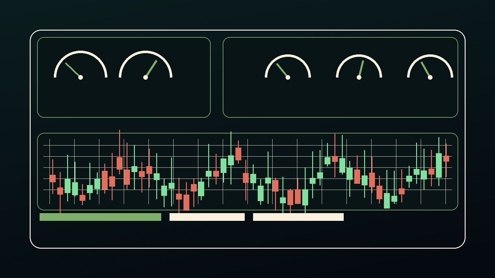
Turning Market Data Into an Instrument Panel
Getting the quote is not the hard part.
The hard part is making the quote useful.
A price on its own is just a number. It only starts to matter when it sits next to the last trade, the spread, the daily range, the reference data, the chart, and the reason I was looking at the ticker in the first place.
That is the piece I keep working on: not another watchlist, but a screen that makes it harder to fool myself.
The quote is not enough
Polygon gives me the raw material. The product decision is what to show first.
A few questions keep coming up:
- Is this price current?
- Is the spread wide enough that the number is kind of fake?
- Is the move happening on real volume?
- Does the ticker data match the company I think I am looking at?
- Can the chart, watchlist, and notes use the same source instead of drifting apart?
I am less interested in having a screen that looks live than having one that tells me when it is not.
Stale data is dangerous because it looks official
A stale dashboard is worse than no dashboard. At least a blank screen admits it knows nothing.
So the boring plumbing matters:
when did this update?
which endpoint produced it?
what happens when the call fails?
what should the page show while data is pending?
what is allowed to be cached?
Those are product questions, not backend trivia.
If a value is delayed, cached, partial, failed, or inferred, the page should say so plainly. No drama. No cockpit manual. Just enough honesty that I do not mistake old data for current reality.
The spread tells on the chart
The last price can be stale, especially in options.
The bid and ask are usually more honest. A position can look fine on a mark and still be hard to exit because the actual market is wider than the number I wanted to believe.
So the screen needs to keep asking basic questions:
- What could I actually buy this for?
- What could I actually sell it for?
- Is the mark reasonable?
- Is the liquidity telling me to slow down?
That is not pessimism. It is just not letting the prettiest number win.
Calm is the point
Market screens want to scream.
Green. Red. Flashing cells. Heatmaps. Bigger numbers. Fake urgency.
I want the opposite. Show what changed. Show what is stale. Show what failed. Show what deserves attention.
The question is not whether I can pull the number.
The question is whether the screen helps me make fewer dumb decisions once the number starts moving.