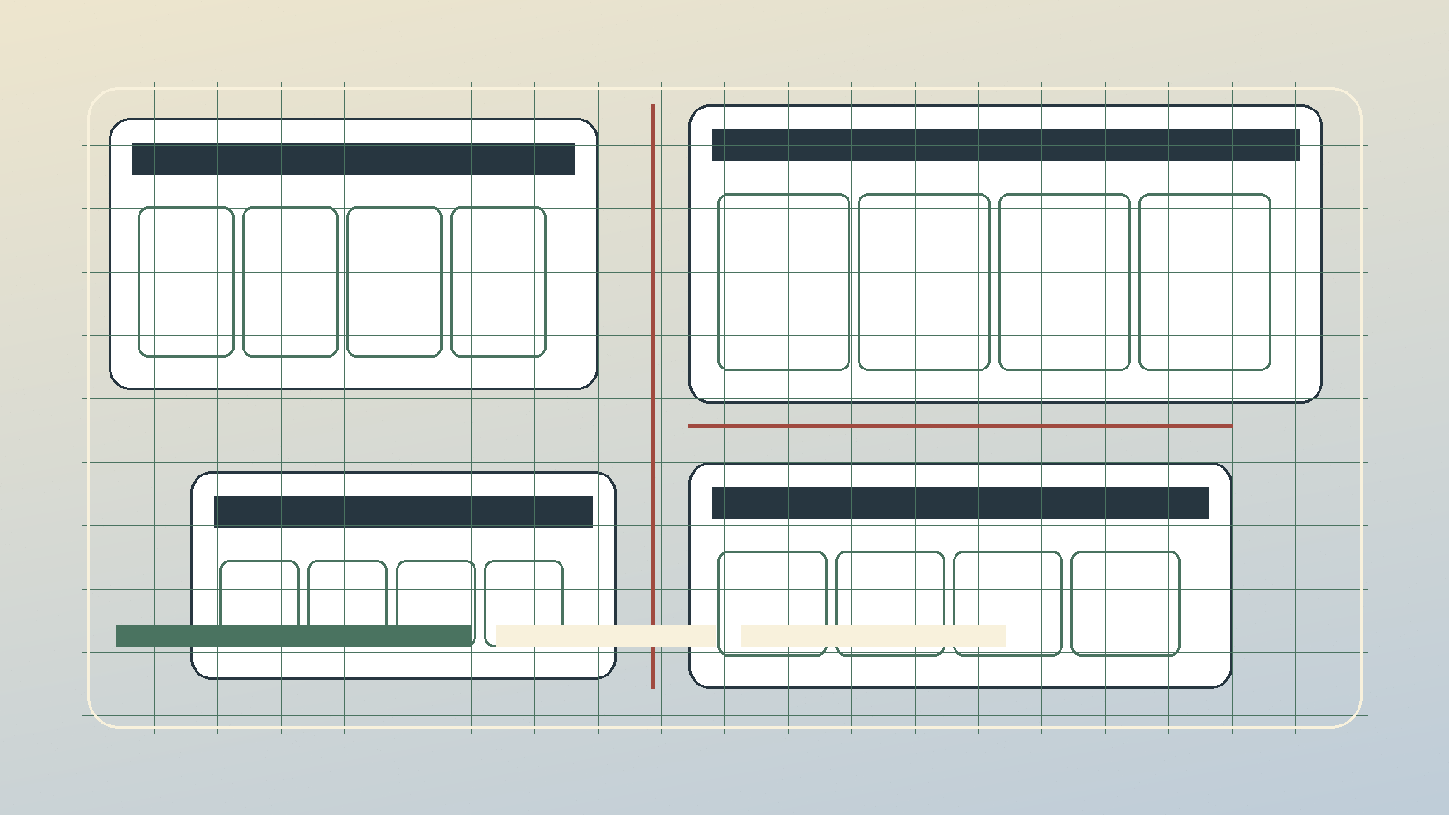
UI Iteration Is Operating Discipline
A dashboard can work and still be useless.
The API returns data. The build passes. The chart renders. The cards line up. Then you open the page and still cannot tell what matters.
That is why I do not think UI polish is decoration. If the screen is supposed to help me decide, the layout is part of the decision process.
The first version shows what I misunderstood
Early interfaces usually reveal my assumptions.
The next few versions reveal what I missed.
A crowded screen usually means I have not made enough choices yet. Every metric gets promoted. Every module wants attention. Every label can be defended. The result is a room full of people talking at once.
Making it prettier helps only after the page knows what it is trying to say.
The work is deciding what gets to speak first.
Hierarchy is a risk control
If a screen is used around money, time, or judgment, hierarchy matters.
The safer path should be easier to see:
- current state before commentary
- source and freshness before interpretation
- useful numbers before decoration
- warnings where mistakes actually happen
- failed states that look failed
That is design, but it is also risk control.
The phone catches the lie
Desktop hides problems.
Mobile does not. A header that felt fine on a monitor becomes a billboard. A hero image turns into a weird floating card. A layout that looked balanced starts pushing sideways.
Annoying, but useful.
The phone tells you whether the page is actually responsive or just pretending.
Less theater
A lot of UI improvement is subtraction.
Remove the panel nobody uses. Rename the clever label. Stop making private infrastructure sound like a product. Move the explanation below the thing it explains. Make failed data look failed. Let the important number breathe.
There is no prize for making a command center look like a movie prop.
The win is opening it when I am tired and still knowing what to do next.